 |
| This picture is worth 620 words! (Click on map and those below to view details.) |
When our Black Hills Montane Grasslands paper appeared in the December 2016 issue of The Prairie Naturalist, I was really happy—happy to see it in print after years of work, and happy to see the map in color. I’m so glad South Dakota Game, Fish and Parks was willing to pay the extra $500. We badly needed color to drive home our message … and a clear strong message is the whole point of using an infographic.
But is this really an infographic? … or just a map?
According to the Oxford English Dictionary, an infographic is “a visual image such as a chart or diagram used to represent information or data.” The term came into use in the 1960s, originally as an adjective. Infographics include maps as well as charts, diagrams, networks and such. When a map emphasizes certain features (e.g. with symbols or colors) to show a situation, trend or pattern, it becomes an infographic.
Such maps (also called thematic maps) have been around far longer than the term “infographic.” The first that we know of was created in 1604 by Gerardus Mercator, to show religions of the world. He added symbols to various locations for the predominant religion. There was no need to refer to a list or table, because the viewer could see the situation at a glance (for example, the New World is filled with idol worshippers).
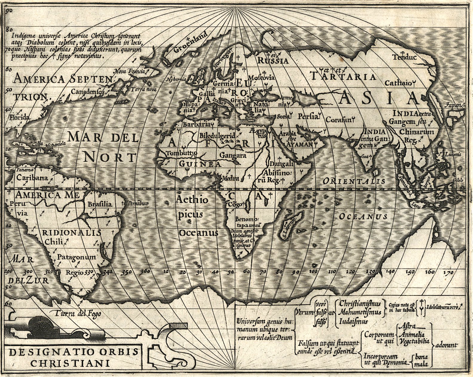 |
| Designatio-Orbis-Christiani; David Rumsey Map Collection. |
 |
| Part of legend, showing Mercator's choice of symbols. |
 |
| Distribution of the Slave Population of the Southern States of the United States; source. |

In general, images are far more powerful than words. They grab our attention, and we process them “with alarming speed.” The brain can interpret a picture on the spot, whereas text must be processed linearly (more here). So if a message is amenable to being communicated with an image, that’s the way to go. A good infographic quickly shows a situation that would require many words to explain. As I worked on the grassland map, I found myself wishing I could skip the corresponding verbal explanation entirely. It would have saved me 620 words!
In creating the grassland thematic map, I had to figure out how to quickly and clearly communicate the message hidden in the massive amount of information we collected:
Black Hills Montane Grassland is a rare and endangered vegetation type endemic (limited) to the Black Hills of western South Dakota and northeastern Wyoming. Only eight mostly-native stands remain. All occur in an area of less than 35 square miles, on public land managed for multiple use. These should be managed as conservation sites.We had the data to prove it. We thoroughly surveyed the high Limestone Plateau for Black Hills Montane Grasslands, finding 91. We evaluated and ranked each one based on size, vegetation quality (% native species), disturbances, and condition of the surrounding landscape. We found only eight A- or B-ranked grasslands. Only 10.5% of original habitat (based on presence of relic indicator species) now supports native Black Hills Montane Grassland.
After testing various symbol schemes on my colleagues, I settled on colored circles, one in the center of each grassland. Circle size indicates grassland size (three categories). Circle color indicates grassland quality (overall rank). The color scheme is intuitive: circles for the best grasslands are green, those for the worst are brown.

 |
| Only eight green and yellow grasslands remain! Fortunately, some are large. |
I recently learned that our grassland thematic map is specifically a proportional symbol map—like Charles Joseph Minard's 1858 map about meat (livestock) sent to Paris butcheries from across France. Minard also used circles of various sizes, in this case to represent amounts of meat. The circles themselves are little infographics—pie charts, with colors representing types of meat.
 |
|
Source includes much more about Minard’s famous and powerful infographics.
|
We dedicated our grassland paper to our late colleague and friend, Helen McGranahan (below, in white shirt). Her concern for Black Hills Montane Grasslands, her expertise in grassland biology and management, and her wonderful sense of humor are greatly missed!
 |
| Botanists at work in the Black Hills, 2011. |
Sources (in addition to links in post)
Cartography and Visualization. PennState Department of Geography. If I had found this site before I started working on my map, it would have saved me a lot of time!
The power of pictures. How we can use images to promote and communicate science. James Balm, BioMed Central blog. (“We process images at an alarming speed.”)
Oh, you immediately convinced me to visit this post with your map/infographic. I find them fascinating, and good ones like yours really tell the story quickly and effectively. Sorry to hear about your colleague.
ReplyDeleteThanks, Beth, on both accounts.
Delete